Video reading area
Origin Ten Technology is driven by a desire to make the world a better place.
This area has been designed to improve Video accessibility for user with hearing problems and for those who just prefer to read.
This is how to get a free website audit By techylabs
Hello, my name is Ruth. And today I’m going to do techlabs, .co.uk website audit. So how is it going to work? I’m going to keep sharing my screen with you for all time. And at the very beginning, I’m going to share my very first impression to your website. As a first time. It’s been customer later on. We’ll go through your whole home page. I’m going to start from the top navigation, then we’ll go through all the home page structure and I will finish with the footer.
Which is here. And then I will go through structure of your website in terms of top navigation to see the naming of all these categories. And later on. We will go to the grid page. So basically where we have where we have all your products displayed next. We will go a bit deeper into
Product page. So basically, I will review your product page to see what can be improved here. And last but not least. We’ll try to go through, add to basket experience to see if I can pre-order, with my fake details if I can successfully, pre-order your product. Okay. So let’s begin from the very first impression. What I’ve got when I’ve just landed to your website. So the very first thing when I came to your website was that I couldn’t understand what you said.
Alec, which is already a red flag because the very first seconds, I would say three seconds, the most important. So just by looking at your website, I have to know what you sound like and I couldn’t. So basically, I scroll down. I try to see what you’re selling. I didn’t check the video first. So we’re just trying to understand from pictures descriptions to then. I saw wooden blocks. I thought it’s a part of WordPress. So, I did some research on Google and basically, after that, they understood that you actually
Raided a new product and you’re trying to sell another thing which I got about your website that it seemed a bit. Inactive, what I mean by that is that that using quite a lot of great color, which kind of Blends together with your logo and everything. It seems that the website is not a fully finished and I’m missing a bit of branding so you could stick to your color. So for example, if you’re using this great green bluish color in your logo, so it would appear more consistency across a website.
It’s starting with a buttons Etc. Because at the moment, I can see this blue, then great color. As I said, all those call-to-action buttons should definitely Stand Out way more and be more consistent across the website. Also. I see like different fonts and everything but the everything of it can be improved and it will definitely help not only to create the consistency across the website but also increase the trust of the website because if the website is not fully finished.
Eight affect the trust of your customers so they come here and maybe you don’t seem fully professional and especially when your product is quite pricey and Niche. You have to make sure that all those things reach and fixed. Okay, so let’s begin a bit more into details and see what can be improved.
So I would like to start from this area, which usually we have the main Banner of the home page and here, I’m lacking information what I was telling so I would recommend to redo all the section to make sure it’s more clear. Maybe you can create like also hire a person on Fiverr or something who could create visuals for you. So you kind of show that from the blocks there are few steps until you can develop the website. So, you put around the blocks.
You scan, it actually show the action or you can put like in the wording like three like a four easy steps to develop your website. Just you know, get your blocks, arrange them, scan it and transfer it to a computer to the digital digital area. Okay, so here I would like to see more like what you actually selling because at the moment I can see image here but its first of all, it’s blurry and second of all like I can’t understand. What does it say? I
Can’t see the words and it makes me think like guess what you’re selling and it shouldn’t be the case. Okay, so just make sure that this image is super clear, super, super clear. You can be steps or even like this text keep in mind that people are lazy these days and they absorb information through Visual not tax. So you have to really focus on your visuals. Okay. So here we can also write that information in steps also make the fonts way bigger because
I would say fonts for all the website make bigger because Google has, well, it would be good for your CEO because the Google would assume like, okay, your website is easy to read, that might be more accessible to disabled people, as well. So just make do that too. Okay. So here we have a call to action button pre-order now, so I’m going to check where it’s resurrecting me.
Okay, read directed me to homepage. Let me see. Try and one more time. Okay. So here is the very first error which shouldn’t happen. So when I want to preorder it, basically redirect me to home page, so make sure it redirects to the product ID list since you selling two products, I would link to the grid page. So basically if you click wooden blocks, so it redirects where you can.
The way out of your products.
So that would be about the, this area, another very important thing, which I would like to focus with your logo, which is part of your homepage, your whole brand, your whole image. So, at the moment, the quality seems a bit too low. What I would recommend to do is to simplify a local because here I can see many like Shades and everything, and you don’t need that because first of all, you losing the quality stuck on the wall, it’s going to be harder for people to remember your
So always remember that the less is more. So if you could simplify the same logo, make the techlabs way bigger, like outstanding that it’s going to be easier to read it will definitely work better for you. I can reassure because there are many tasks by myself. So it’s really the case when it has to send out the quality has to be good and easy to read. Because at the moment, the local is so small. I can’t even like, you know, need to go through the page to catch. Where’s the logo? So, going in X here, we have the
The video video is amazing. They really convert to real good. The only thing which I would recommend to make the video a bigger like from here to here because it will take more space build your website using customizable, wooden blocks. Okay. So the same copy I would make in one line, not too because it takes unnecessary space. So for example, here, we have a lot of space which can be saved. So if you could have it, you know, just the text in one line.
The video is amazing. This is what I want to see on this is where you communicate. And here I see this beautiful yellow color. So why not incorporate those two colors that you have in your logo and the yellow for your whole website. So, for example, maybe you can build the buttons in that yellow color. Another thing which I really like about the video. It really explains what it is. But if you think if I land to the website, I need to
try to do something here where I have no idea what’s going on. And on the year. I see the actual information. Went to see, maybe think idea would be to make the same video in silence, like remove the sound and put it here as a background. So it automatically starts showing what’s going on and it also would give that more than feeling of the website and hear you mention very good points, like, you’re selling points that you should be communicate. Another thing which I would recommend to do on your homepage is to basically
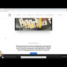
We pick those selling points from the video and turn them to icons. So here you can put at the bottom like summarize of all the video that just like easy to use, it works with those and so those platforms, you know, those selling points. Okay, interest-free installments keeping on go by spreading the caustically. Okay. So at the beginning, I wouldn’t be communicating this pricing think because first of all you need to make sure that you prove to the customers that they need your product.
Okay. So the pricing is going to be a bit next step or you can leave it in the product page. Okay. So and again, it doesn’t seem much information. It just contact us. So maybe I would recommend you, instead of having this long sentence, which again takes a lot of space to be transformed into icon showing like saving money or something and you can say like you can spread the cost. That’s it. This kind of like a feature that is available for the project and
If you would like to learn more contact us, okay, so you don’t need all this long, text choose a pricing option. Okay, so get this is where I got a bit confused because it’s a new product and I never work with it. So it’s normal that I need time to learn about it. Okay, so we have micro-site wood blocks and WordPress website. Bundle e-commerce wood blocks. So I’m trying to understand if one package is better than another one for starters. Yeah, I see. So this one’s for my basic and this one.
For websites. Okay. So whenever I have two options like two packages, let’s say what I always recommend to do. So customers basically would like to compare those products. So what works really well is to have a table where you could put microsites wood blocks what WordPress website bundle e-commerce wood box, you put those two then you put features like in a list and then you can make a nice table showing collect tick or cross.
So basically it will visually simulate them knowing like okay if I go for like maybe more expensive version, I get more benefit and it’s visually with those red and green color place. The thing, you know, it really stimulates people so you can compare. So, for example, lifetime access all the time presale. So on those to click tick tick and now you can create a composition and then customers can choose what they want. Another thing. If you can see the quality,
Of the image is very, very poor. This is one of the first things you need to do its e-commerce. So it’s all about the visuals. So make sure that you have very high quality of these blocks because the product is beautiful. It sounds, you can make, you know, many beautiful shots unless it’s like stimulated shots. I’m not sure if you actually shot the product or it was like, you know, Photoshop what you can play around that, just make those two. No super crispy. So like, people can see that it actually made from both like it.
I can sense the quality because at the moment when I look at these images, I can read what it says. So okay, I can barely see it as content colors maybe. But when I look at first glance, it seems like it’s like business cards. Like paper ones. And your goal is to show the features that there’s actually would. It’s really nice to play around it to Noah just build the website. So that would be the main point. Okay, then we have
Okay. So yeah, we have another paragraph and seems the information starts getting a bit more repetitive. So, basically you communicate the same thing that you communicate it in the video. So I would consider even to eliminate this part, unless you really want to showcase this one video. But again, it doesn’t give me much information about the actual wooden box. So it’s more about, you know, the website after. So I would say remove this part because
Homepage is relatively long for this kind of products. So customers might boost interest already. So that’s another think we should pay attention to that. It doesn’t have to be too long that if you provide a lot of information, doesn’t mean it’s good. It’s all about how you systemize that information and put it like, you know, logically and like simple to read. As I said, those examples with the icons.
Okay, we have another section. And again, we have very low quality image. I don’t know if it’s your finished website or just like at the moment, but let’s say I’m a customer, so I’m giving you feedback if it’s completed website. Okay, just to make it clear.
Okay, so all these information, it’s too long. It’s way too long, customers not going to read these lungs paragraphs. So your this is where you have to think about creative ways to do that. Either you play with the fonts, you know, like emphasize you bought some words, make different colors. So it really pops out on those selling points or all you do. As I said the icons. I really like the icons on and know they perform well and you can even ask like
Designer to make animated icons for that.
So it will be icon and a little bit of text that could basically summarize the whole paragraph.
Okay. Now this is a pre-sale only. Okay. So this information is important because you can actually buy the product and have it like in coming weeks. So the very first thing would be the layout of the website. I would recommend you to put it in the white paragraph, instead of column because it kind of all your website takes all the space. And suddenly we have this one column and it loses that consistency. So again, I would highlight this part because it is very important.
I would also put this information in product page. So when I go to product page, I’ll probably repeat the same point, but the pricing is very important.
Frequent questions. Okay. I’ll talk about this in a second. But this part shouldn’t be here. So I would recommend most frequent questions in a separate tab here. So we could have wooden blocks frequent questions because it’s really important. Also expand this way more, add more questions about shipping terms, you know, also, like for example, am I going to get the orders like within two weeks and you need to reply? No, it’s only presale. Exit.
To provide all that information, choose pricing option. Okay. This shouldn’t be here because it’s repetitive. We already have. So definitely eliminate this part, this one features. Again, you need to rebuild upload image. Okay, this this is missing information. So just make sure that you write those features at the top of the homepage. Another thing which you can do, you can, if you want to use some images, you can do.
Just write a list with the like ticks or bullet points because one bullet points. It’s way easier to read for customers. So I have work points and on the right side you can have, for example, that animation instead of this long text. Okay, and then we have have
Kind of block party as far as I understood. Yeah.
So this one just remove because this one bespoke software. Okay. So we do rename this part either. They’re more like learn about, learn more about it or block. You don’t need it on home page for sure. So just delete this block. Okay. Next thing would be footer. So
Trying to agree with that.
Cookies. That doesn’t allow. Okay, but I check your home. Okay, it’s gone. So for the footer, so here you definitely need to have more information and some information from your top navigation, should be moved at the bottom. So let me walk you through that the very first thing which I would put here. It’s contact us information at the bottom because this is standard layout and this is where people unconsciously looking for that kind of information. So move contact us here.
You can have it twice at the top and at the bottom, so we’ll leave it here and just integrate another navigation here. Another thing will be also integrate FAQ, which we had our home page. So just remove from home page and have at the top and at the bottom navigation, what’s next? Also, you can Implement block the same that you have at the top and then would be you, I’m missing one big part. It’s like all the Privacy terms.
So, also, just put that information here. So people could know, you know, what happens, if they don’t receive the order like, returns Etc. So, all of these, I think it’s even has to be defined by the law, you know, so, it’s really important. Then you have your social media accounts. They should be way bigger because they are super tiny YouTube. Facebook just make it bigger and put it a bit to the left side. So because now it seems a bit stuck to the right side and we need one that nice and block in the middle. Okay?
And then if the going back to the top navigation, okay, you have privacy policy gears. So sorry. I didn’t see it here because I saw like that so I actually need to scroll up. Okay. So this is one of the reasons why you need to move it there because it’s quite hard to find it. Let me check. So if you could move this page in the bottom navigation, will be great.
Fabulous, you have all this information. What I spoke again. You can highlight like step one. Step two. Step three. Just make it more visually appealing and then just move it to the bottom office equipment. So
Okay, this page is not even working remove it. If something is not working or information is not try to just make sure it’s not on the website because it really ruins your image and how your page looks even professional or not. Because of the moment. I would think, okay, they even didn’t care to fix the website, if you know what I mean, and then we have Community areas.
Okay, so I would remove that too because you have login and sign up. So I would say just remove the whole black line here because to have all this information here, login, sign up, you’re going to move privacy at the bottom and instead of that, what you can do since you’re offering 30% off, which is your selling point. Okay, and you want to communicate that. So in that line, I would use that yellow color that you have in the video and just put it at the on the line saying, pre-order now.
It’s kind of one of those triggers that encourages customers to convert. Same as like, you know, like free shipping or like 30 days left like 30% off, Etc.
So that would be my advice. Okay? Going next to your grid page. So when I go to wooden blocks were actually want to shop. I see this.
Okay. So here we have the name and wooden blocks. I would either remove this area.
Like, in general, we don’t need that. Or I’m going to replace it with a mood Banner. What are some advantages? So, basically, you either put a nice paragraph explaining, what I’m blocks. And, again, you write a short description or you put an image, which would be relevant for the whole category. In this case, your product with some blocks. But since you have only two products, I would say you don’t need that. And then imagine, if you remove the wooden blocks, you can already see the
In school more scroll down. So the whole gray area will disappear and you will have two products with why is it important? So basically, if I click on wooden blocks, it takes time for me to scroll and your goal has to be minimized, the time customer converts and take the last steps as possible until they finally convert. Okay, so if you can remove that then we’ll see.
Results here. Okay. Next command would be sense of having just two products. You definitely don’t need filter option because there is no way to filter and it just takes additional space. Instead of that I would do, I would definitely make these images bigger. So takes a whole page to beautiful high-quality images, sale sale, I’ll comment on that too. And then we have add to basket. So talking about add to basket. It’s called to
Some button. Make sure it’s turned out again. My recommendation would be to use the yellow color yellow, or this logo color here on the button. So, yeah, it would stand out more talking about the sale. First thing is, if you going to run a sale on your website for the future and whatever, make sure that the price colors different, it goes to a deeper level.
I love like psychology level if like people see red price. It means, okay. It was way more expensive. I can save or you can play all the way around. You can put this price in green color. Meaning. Okay. This is way cheaper. So if you can create that contrast between the prices would be great and it would really convert.
Okay, then you have a sale.
Yes, what I wanted to say about the sale. So sometimes when you making too many promotions of my create negative impact for your brand. So, especially if you want to create high-quality product like that really stand out, you know, like not a cheap like version or something, try to keep a balance and sometimes have
Like just one product on sale or half of it because when everything is on sale, customers might think why they selling everything like, why there’s a sale all the time while while why there’s always 30% off. So probably no one else is buying and they just trying to sell out this stuff, if that makes sense. So but it’s another topic like it would be a pricing strategy. So okay goenka next to the product page.
Okay, just scanning it. Okay, so here I can see the images way better quality way. Way better with let me zoom in a bit.
Yeah, it’s really good. So if we could have these images on the page, home Patriot would be huge difference. Okay, so, additionally, I would like to see more images. I would like to see the packaging, but now I’m assuming that the product is still in the development stage. So you might not have those images but talking for the future would be amazing. If you have boxes. You can even create unboxing video, you know, someone buys it.
Then we have the price will be the same common, just play a bit with the price. Again. You can use your brand color. So maybe you can put it in green features. Yes. I see some bald here. I would use here black font because again, when you use gray, it’s a bit seems inactive that the website is not fully working yet.
Okay, so description additional information.
Okay. So here we have this number GT. I am. As far as I remember. Those are for Google. I think we’ll go shopping. Right? So you don’t need to display that information, same as category since it’s just one product. So I would say remove the section, so, it will minimize.
The noise of the product page share instead of that. Instead of this information, what you should definitely blame at this pain payment method. So if people can use PayPal, you know, Visa, Mastercard, all that kind of information. Then we have social share buttons, which is okay. What is this?
Okay, I never seen this but from icon, that’s why I checked. So yeah, and then we have description.
Okay, so additional information. This is not. Not relevant problem. It’s a mistake. So just remove that. And instead of that. I would rename it to pricing options. The one you had on the homepage. The one I said, I will talk on a product page. So basically they can people Pagan farts reviews. Okay. So if you currently don’t have reviews, I would recommend removing reviews and because if it’s
Again, it will creates that image that okay, probably not, selling course not a popular product. So you don’t want that. So just remove it. And instead of that you better after the customer actually purchase is the product, you can send them request. Would you be so kind and reviewers that we would like to publish, you know, on our website. So it again it will increase the trust and general image of your website and then we have cross sales.
I wouldn’t say that you need crosses because again, it’s only two products and it looks quite empty and it just one. So I would just remove that because from the homepage people already, get familiar with the project. What you sell.
So you do need additional cross sales?
Okay, I’ll add to basket just to see how it works.
Okay, I’ll come back to the to basket later on because I want to review the rest of the
Of the categories. Okay. So now we have contact us form question certain. Okay, email social media. All right. Okay. So the very first thing is, again, we see a lot of great colors. So this is actually where I felt that feeling when everything is in great color only, for example, this map, it seems inactive. So I don’t know what I can do here, you know, if it’s working or not.
My other concern would be since I’m seeing techie lab co.com. I assume this is UK company British one. So here also, see your email phone number which is UK and then I see that you in Poland which is quite confusing to me. And I don’t know if it makes me feel like if I can trust that company like why they in UK, but suddenly they showing City
In Poland. And if the person is not familiar with Poland, you can see that. It’s not even, the not even the capital wash or like, Lublin in or dance. Those like biggest cities. So, I would say, in this case, just remove the map. If people would like to contact you likely fill a need your details. They can always send information. So I would say, just remove the map and have on the left side. This information phone number email and then
Of this contact us form on the right side. So people can actually fill it and contact you.
The same thing for the button color, but if you change it on the settings, that will apply for the whole website and then we have bespoke software UK, which I would your name to block because these are more like news, you know, like all the news because I can see remote and it disappear. Okay, so when I scroll down it disappears, which shouldn’t be so just make sure it doesn’t appear.
Just trying to read all this information, and now he disappears. Okay, so I see if you actually hiring a person. So, instead of having a post here, which is not that visible, and people barely would go to a block to look for a job jobs jobs. Yeah, I see those.
Oh, I can see meet the team. That’s another thing. I want to flag to you. But talking about the job since you have actual job offers. Just put it on the footer name, it careers and half like currently, we’re looking for you, put the position name, then you click it. And then you see the whole ad I saw, you have it, like, with all the description and everything. And then what else I would recommend? You can say currently open positions, the name of the position and then you can write one sentence. Like if you don’t find anything available, that would
Like a profile. But you think it would be a good fit for our company, feel free to contact us and then just put email, so people can still apply and you never know, maybe some Talent can land to your company. Okay, and then we have me team and there’s nothing. Unfortunately. I would love to see the team behind this product actually who created. So contact us or you can create a new tab saying about us just add your team picture short descriptions.
Us to know who does what like or you can write even the story. How you came up with this project and how it was developed.
So don’t take this information advantage and make sure you use it to benefit from it.
And the last thing pre-order now. So it redirects me to homepage again. So yeah. Oh, yeah, I check this one. So just remove this part here because you have quite many call to action buttons, pre-order. You can make it bigger here on the homepage, and then, if you’re going to take my advice and use pre-order, now at the Top Line, you can make it, clickable to, so customer redirects to grid page. So basically,
Where they can see the products.
And last but not least. We will try to do the check out.
Let me see. Okay. I really like that. It’s basically in the same page.
First name, house number 38 account.
Credit card, stripe. Direct bank transfer. Yes. So all those payment methods put it on the product page and another advice which will help you convert. So put those credit cards like all the striped ones, like MasterCard Visa, whatever, put those icons at the bottom, next to social media. So people could know what methods they can use.
Just checking billion. First name. Last company name.
Let me test it. Okay, so I’ll just try to put the main information on but everything seems decent, you know, you can do those tests and orders to see if the order actually goes through. What is the stripe integrated? Everything seems fine. Ok, so I think that would be it, we covered all the main areas and all the product pages.