Video reading area
Origin Ten Technology is driven by a desire to make the world a better place.
This area has been designed to improve Video accessibility for user with hearing problems and for those who just prefer to read.
AMETEK Website Review By techylabs
So I’ve landed here on the amtech.com website. Homepage. What am I? What I’m going to do is I’m going to start on the homepage. I’ll work my way down and then I’ll work into some of this navigation appear at the top. Until we get to about 15 pages or 30 minutes worth.
Okay.
So immediately what I’m noticing is there seems to be quite okay a rotating images here. I think it’s a lot. It’s a little overwhelming. If anything, if you’re going to have rotating images here there, I think you should keep it minimal and you should keep it to more of your of the aim Tech business model mission statement, maybe since ctas to some important parts of your website, maybe two products. It looks like maybe this is products if I’m
Discussing me, see.
Yeah, looks like there are the same maybe CTA to the products or something like that. But I think that would be a better use of space here. Instead of rotating through each of these and to keep in mind. This is one, two, three, four, five, six, seven, eight, nine, ten. The, someone hat would have to click through without coming up here, you know, assuming that they would need to come up here to products first before they can get proper information. I think there’s a better way.
To lay this out. I think listing all of the products like this on the homepage is a good thing to have, but I would maybe consider that being moved towards the more towards the bottom of the page. And then like, I don’t know, a grid format, maybe with some high quality photos. To accompany each of those products that are offered maybe with a read more CTA like we have on each of these that takes you to the actual
duct pages, but more in a grid format down here, where you can, where a potential client or partner could read easily each of those different products instead of having to scroll through these
Okay, I make my way down just a little bit.
There’s a lot of wording here. I don’t know that that’s the best thing to have on the homepage. As a whole lot of words. You want it to be concise to the point have actionable. Next steps available all over. And I feel that that’s really lacking here. It looks like maybe this is some about information. So if anything adding an about ctia something that says like read more, that takes them to an
A more thorough about Paige.
Seeing with, like recent news, a CTA, that takes them to a more in-depth recent news page, and even stock info. If there’s another page on the website, some, you know, for that. Because it doesn’t look like any of these things are clickable, except maybe he has said, maybe these under recent news, each of these. But it’s only showing three. I assume that there’s probably more recent news, you know, so if you’re going to feature some on the homepage,
Page. Then I would have an option to be able to guide a client or whomever is roaming the website to the next place where they can get even more of that in the same information.
Okay, and I’m just seeing a little bit of errors here. Looks like under the stock info area like this little green arrow. It is. Doesn’t look aligned. That’s just something minor. But something that does is very noticeable on the homepage.
I think that otherwise that there’s more opportunity here to expand on the homepage. I don’t see necessarily a clear mission statement if there is one already for the company, I mean, maybe it’s
You know, something in here, but that’s where I feel that a mission statement should be front and center on the homepage. Going through, you know, high quality rotating imagery here at the very top with with that mission statement information. I think this type of website is deserving of a mission statement and that being very clear on the page.
A couple of other things to expand on with with all the within the sorry within the home page area is maybe I think like prominent partners that you met a team name, techne work with noting those and a more visual way, like with their company logos and things like that. Or
Maybe I’ll have to just kind of go through this. Maybe I’ll come up with some more ideas that are maybe prominent to list here. So I’ll keep that in mind as I keep going. But those that’s just some ideas for now.
Okay.
All right, so I’m going to keep moving. I’m going to take a look just right down here. I just want to see that you know, things here are clickable down here in the footer.
And immediately, it doesn’t seem.
That they are. I feel that these headers and over each of these areas within the footer, should be clickable to a main landing page, just for navigation sake. That would be nice and I don’t see anything under contact us. I mean, this isn’t clickable, if there was, if it was then it could assume you probably have okay, you have a contact page. So taking making that clickable to go to the contact page adding a CT. I hear or even a
Arm that kind of stays open in the footer area, but this isn’t a great user experience, you know, not being able to click into some of these things.
Okay. So what I’m going to do is I’m going to kind of work my way across the top. Now. I’m going to start with a bout Us by just clicking into the actual about us navigation up here first.
Okay.
So it looks like I’m just on a basic landing page here, maybe.
Actually, I think it’s a landing page for businesses. I don’t know if that’s the best customer experience. I feel that it should have a proper landing page that includes, you know, an overview of each all of this information that we have broken out here and subcategories under about us and not necessarily going to the first page listed here.
I don’t think that’s the best experience. What you could do on a landing page as again, kind of with that grid format. I mean, visually you want it appealing. You want to interactive graphic, you know, things like that. And so putting things in a grid format with imagery, and little text is good. And that’s something that could be done here. The, you know, all of these, you know, different subcategories under about us could be in that type of format.
That can be clickable that goes into each of these pages. Okay, so but it looks like looking at the URL looks like and right here looks like we’re just took a straight to the businesses subcategory.
Okay, so I mean it’s very basic overview. I don’t think there’s necessarily anything bad about that in general. So I think that’s fine at other than the images are very blurry. It considering, you know, this is a corporate company. You would automatically assume that higher quality imagery would be a big priority amongst the website and yeah, these are just not very
Good quality.
I’m just going to kind of move down some of these businesses. I’ll start here with businesses and work my way through so I’m going to do some of these.
So, Baker’s systems.
And I see that it has a bigger systems here as well.
Okay, so looks like it’s just more information on getting in contact with this business.
I don’t think it’s necessary to have another click required from the person viewing. The website to have to get to, to be able to get even more information. I think that’s just an extra step that isn’t necessary, all of this information. I think, would absolutely be listed on this main page. I think this means Pages, good. We know that with the basic information regarding a baker systems, but then having
Adding that whole contact, blurb that was on this page to to this vacant main, a beko systems page. I think is would be a better experience than having to click again.
I’ll just move on to the next one and see if it’s the same.
Yeah, so same format now. There are more here. So it, you know, I
I think it could be okay having, you know, these extra subcategories under this business, for example, but for sake of minimizing, the number of clicks required, it would be good to consolidate these down to be featured specifically on the advanced motion Solutions page.
Okay, so I assume that, you know, most of these are probably going to be the same situation, just a little insert about each of these businesses and then all of the different businesses within that category, so I won’t get too much more into this. You know, for the most part. I would say that that what I mentioned about a beko and advanced motion Solutions applies to the rest of them as well.
Getting rid of the extra click and updating with high quality imagery.
Okay, so we have overview.
So, this looks like the about information that we saw on the homepage. If we were to consolidate the wording. Let me go back. Consolidating, the wording here at under, aim Tech, at a glance on the homepage. Adding a ctia that says read more, and that takes the person to the overview page, which is where you can elaborate on all of these extra little things. And you mean it’s good because you do already have more
Operation on corporate overview, you know and we’ll report things like that. So it’s more in depth than the homepage, but I think the homepage is maybe a little too much.
Let’s go down to sustainability.
I think this is another area that could be a real highlight on. The homepage sustainability is so important for business, partners clients things like that, you know, around nowadays, you know, so it could be an opportunity to expand on on the homepage and to feature your sustainability efforts as a company.
Yeah, I mean, I think this information is good. If there was anything to add to this page, if there were maybe sustainability related articles, regarding aim Tech, that could be added here that are related to the sustainability efforts of amtech. And that would be, you know, a good thing to add here, you know, information about innovation of product and services for a better future, you know, something like that.
Environmental safety, things like that. I feel like there’s a lot that you could expand on and sustainability. You have a good base here, but I think that there is there could definitely be more given the priority that it is for so many people.
Okay, growth model.
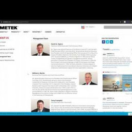
Okay, I don’t really have much to say here. I mean, it’s good. It’s easy to read. I like the molding kind of breaks up the text and it’s visual. Yeah. I’m going to move down the mark management team.
So this looks like basically the executive office. And the first thing I’m thinking is what about everyone else that is involved in an attack that are the everyday people, you know, behind the scenes. I think there’s a lot of opportunity especially in the corporate world to be expanding on all of the people, the diversity, the inclusivity, all of that within a company and this could be anywhere from featuring different teams and their successes.
Accomplishments or wins, you know in this quarter or something like that. It could include gallery of the people within the office or on you know, in the field or what have you Employee Appreciation, maybe like group pictures of different teams and departments and just highlights of what each of those departments do. This is very, you know, CEO Centric, and it’s always good. It’s just
It’s just a nice little extra thing that makes people feel good about seeing company and working with a company when they can see everyone that’s involved and how they’re involved and that it shows that the company itself is inclusive.
But otherwise, this is good. And I mean, it’s I do think it’s important to Showcase, you know, some of the presidential and executive officers here and it’s good that you already have images of these people here. So that looks good supplier responsibilities.
So a lot of white space here.
I think I don’t know much about, you know, what these different documents are. But if you know a way to fill in the white space, as what I’m thinking about is, maybe breaking each of these out into a little, you know, about blurb for each of them with the download, or if it’s possible, just on this page, shortening, the tweets sidebar, so it’s pretty long because it’s just taking you. It’s just a lot of white space here.
But otherwise, I think, you know, this is simple and to the point. So, okay, let’s move over to products.
Okay. So again, I feel that this needs a landing page. It took me straight to looking at the URL looks like it took me straight to Aerospace and defense and and the same thing I was saying before, I think that there is very Visual and creative ways that you can create a landing page to Showcase each of these product categories and a way that is super easy to read.
You could even keep this side navigation, but also just creating just a more appealing way to list these on the actual.
Product category page because this looks so it took me straight to Aerospace and defense.
so, it looks like a little bit of what about for each of these and then
Let me just see what these.
Okay, I am not knowledgeable and this area, so I won’t really go into these Pages too much, but I’m looking back at just the first product page here. So, Aerospace and defense. I also, I don’t think if you’re, if we’re going to have sub categories listed, broken out over here in the left, navigation, under Aerospace, and defense. I don’t think that they need to be listed here.
Below. And if they are listed here, then I think that they need a, they need to be linked to. So someone could click on maintenance repair overhaul, mro here where it says that underneath the about, and it takes them straight to maintenance repair overall. That’s just a little like navigational user experience type thing. That would enhance this page quite a bit.
Something else. I’m at. Well, let me, let me look through a couple more.
And let me see if they’re all the same.
Okay. Yeah, I would say that this is, you know, the same. I would either get rid of these subcategories here or link these to these Pages here.
Yeah, I assume that this is going to be the same for all of these product category. So I won’t go too much more into those. Something that I was looking for, though. On these pages is a CTA. I’m looking for something that gets me in contact with you. If I am unsure about the products that I’m looking at, and I think something that should be added to each of these product categories, is a contact, maybe like a contact bar here, or even a contact.
Worm or just at, you know, high quality image that has a CT. I that says, contact us. That takes them to the contact us page so they can get in contact immediately. I think that would be a nice touch to be added to each of these Pages being that these are products.
Okay, let’s move over to news.
And sorry, I thought about one more thing.
I think I was on this one.
When I was kind of skimming through this, I think some of this information could even be bullet-pointed and I mean, I’m not going to go through and read each of these but I need a some of this information just for the sake of making it a little bit easier to read I think could be bullet-pointed bolded and different things like that. That’s just breaks up. Some of the thick text are thick amounts of text that is and so it’s easier to just skim.
If that’s, you know what you’re wanting as it potential client, so let me go back over to news real quick.
Okay. Yes. I mean this is just it’s generic gets the point across its. I mean, there’s a basic page. I don’t think there’s too much that maybe we need to be changed here. If anything, maybe laying this out a little bit different to include some relevant imagery which each with each of these product. Sorry, recent product and business news entries.
I see that there are some sub category, so it and so, navigating to news here, immediately takes you 2 News at a glance, which I think that’s fine. It’s an overview. I don’t think this necessarily needs a landing page, like maybe about us or products did. So then there’s also
products and business news, which looks like is this corporate and financial news here, and then trade shows. And I don’t see any information about that here, but that could be just something else to fill up some of this Blank Space.
Hi, like another just little kind of like this, this little bar of information, something like that for tradeshows would be a nice touch.
Okay. Yeah, I mean these are simple. Clear CT is
Some images that kind of break up the text, which is nice bolded.
Article titles. Yeah, I mean, I think that this area is good.
Same with corporate and financial news.
And yeah, trade shows, and adding trade shows to the news at a glance. It could include, you know, seti just like those other ones to this page. So, okay, let’s move over to investors know if I just click and Buster’s. Okay, so it takes me and basically towards separate website.
I have to say immediately. I’m feeling that.
That investors was kind of an afterthought in a good way like this. This website came later than the official aim Tech website dead. It’s a lot more modern and clean looking. I won’t go into too much of this.
I’m going to kind of work my way across here.
Yeah, I mean overall I think that this is good. I love these. This is kind of what I was thinking about for the main website as well. Just these little graphic boxes that are easy to click into and they’re just visually appealing.
Okay. I’m just curious where okay. I wanted to just see.
If these were all taking me, okay, so they’re all taking me to that investors Dot amtech.com.
Okay. Yeah, I don’t really have any just just for the sake of this basically being a second website. I’m not going to go really much more into this but just at first glance, I think it looks really good and you know easy to navigate.
And dare I say, you know, a little bit, just more appealing than the official aim Tech website.
So, a little bit of inconsistency between the two, but I do think that the investors website looks really great, moving over to careers.
Yeah, same with this.
Modern updated really clean.
Plenty of ctas.
And I think that, you know, you could you could compare the careers and the investors website. A lot to the official amtech website in how many like CT is, there are amongst the homepage different things that you’re featuring amongst the homepage. That could be, you know, even you know, a video things like that. That could be translated over into the official amtech website as well. Just little things like that that make it
Much better.
And here look, we have some about our employees which this this is the type of stuff that I feel should be and could be.
Talked about more on the management team area as something, even creating, maybe a meet, our team, take the CTA that may be on the homepage or something like that. That would be really nice. You have some of the images. You have some of the events that that are, you know, take place within a nametag among the employees. So this is so exciting to see, but I it’s not being featured on the website, and if you’re not looking for a career, you’re not going.
Coming to the career website, and you won’t be seeing these images. So, I don’t know, just the way to feature some of these other hard-working, people among the team.
Oh, awesome. Okay, Anna diversity and inclusion. That was something else that I was thinking about for the official, aim Tech website. Also could be included under about us, could be featured on the homepage because that’s very important to many people is seeing that diversity and inclusion amongst the company. So yeah, sustainability.
Yeah, these are all three of these things are so great.
Could take some pointers from your own careers website into this one.
Okay, let’s move over to contact us.
Okay, just basic little form.
I would say if anything here, a lot of there’s a lot of information that’s being asked for here. The less information that you are immediately requiring of someone. The better. Some people may be thrown off by a dress or something, even though it’s not required. That’s just a thought. The only thing I was thinking is adding a map with the aim Tech corporate headquarters address and everything. That’s
You know, something else that you typically see on a contact us page, but I don’t think it’s totally necessary.
Okay, so I’ve gone through, I believe about 15 pages. There was a couple of things that I wanted to come back to the home page for based on what I would looked through on these pages.
So I’m just trying to think on different things. So, you know, maybe some ctas that could be added to the home page is something for investors in something for careers, given those are going to be going to separate websites, but they’re both, I think important parts, you know, of the website that could be easily featured on the homepage and a different way. Other than up here in the navigation. Let me
I think I already touched on sustainability. That would be a really good one. Same with the inclusivity and the diversity of the company.
Maybe like team highlights. Also even even down to like, what aim Tech is currently working on what their goal is, what what they see further future, things like that. I felt that is a little hard to easily come by on the website. Now, it may be deep into one of these pages that I didn’t do a whole lot of reading on, but I think that there is a lot of opportunity to really focus on
Focus on those things, like the mission statement and things like that, where you’re going, what you’re doing. All of that to, it’s all important and I think it should be featured on the homepage more prominently than these products. Like I would feature that here as the main, the first thing, you see, when you land on the homepage and moving products down in that grid like style that I had mentioned more towards the bottom. Yeah. Just making those things.
More prominent on the page, I think would be good.
Okay, I think I have just about reached 30 minutes and I believe I’ve it about 15 pages. And if I am sure to any, I promise you, that I will write up anything extra for you in the in the website summary that I will also be sending you. And again, in that web site summary is going to include the see any screenshots of what I’ve gone through today plus screenshots and review from a mobile experience, on my iPhone 12.
So I will get all of that to you. If you have any questions, just let me know. I hope that this was helpful.